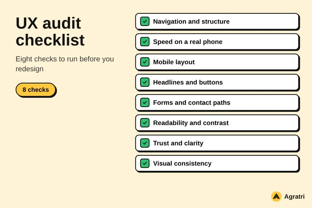
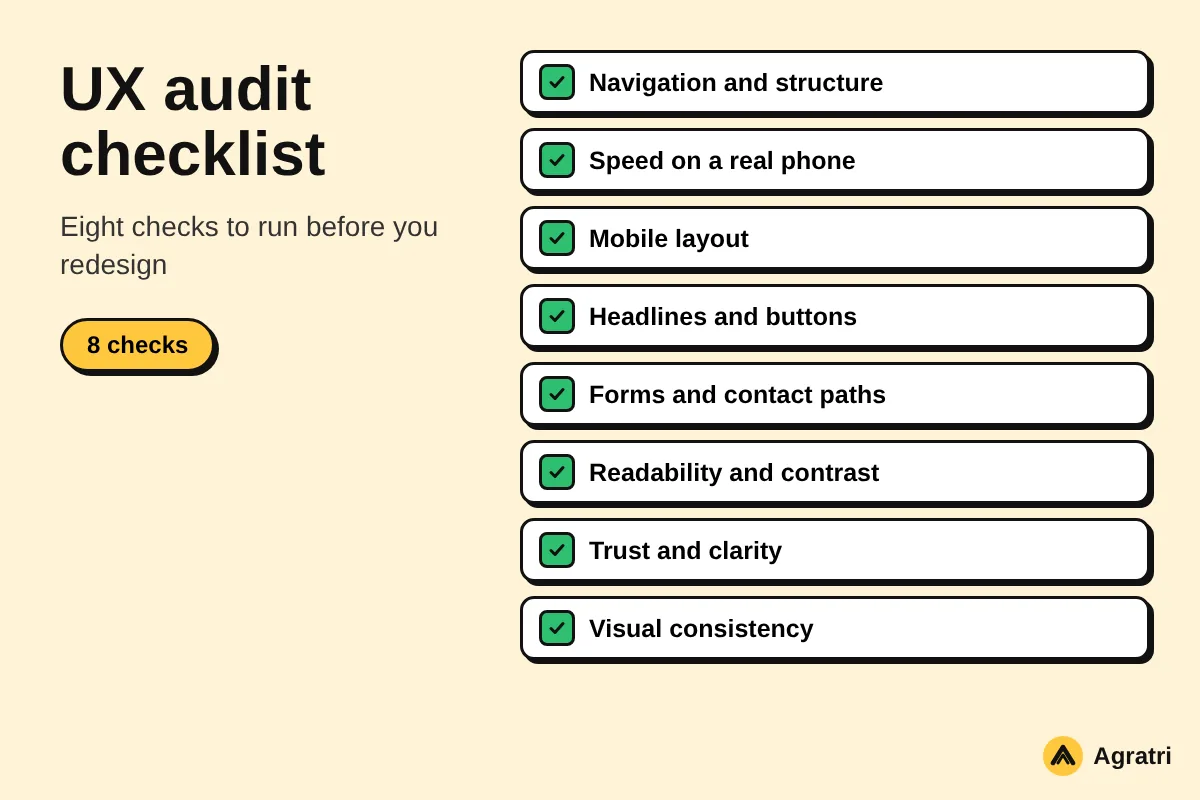
A UX audit checklist helps you find out why visitors leave your website before they call, buy or book. It turns a vague feeling that the site “doesn’t work” into a short list of problems you can fix in order. This guide gives you eight checks you can run in one afternoon.
You do not need special software or a research team. You need your own website, a phone, and a few honest hours to work through this UX audit checklist. By the end, you will know which problems to fix first and when it makes sense to ask a designer for help.
What a UX audit checklist should cover
A UX audit looks at how real people move through your site. It asks simple questions. Can a visitor tell what you offer in five seconds? Can they find the next step? Does the page work on a phone?
A good UX audit checklist keeps the answers practical. Each check ends with a clear fix, not a long report. That is why this list has eight checks and no more.
Note that a UX audit checklist is not a visual redesign. It finds the friction first. Then you decide whether a few edits are enough or whether the design needs a bigger change.
Before you start: set a goal and pick your pages
First, write down the one action you want visitors to take. For a local business, it may be a phone call. For a studio, it may be a contact form. A store wants a finished order.
Next, pick the pages that lead to that action. Most sites need only four or five of them, such as the home page, a service page, a pricing or product page, and the contact page. Auditing every page at once makes the job slow and the results messy.
What to have on hand
- Your analytics, if you have them, to see which pages people leave most often.
- Your phone and a laptop, so you can test both layouts.
- One friend or colleague who has never seen the site.
- One simple sheet to record each problem and how serious it is.
The 8 checks, one by one
Work through the UX audit checklist in order. Write each problem down as you find it, and do not try to fix anything yet. Fixing comes after scoring.
1. Navigation and structure
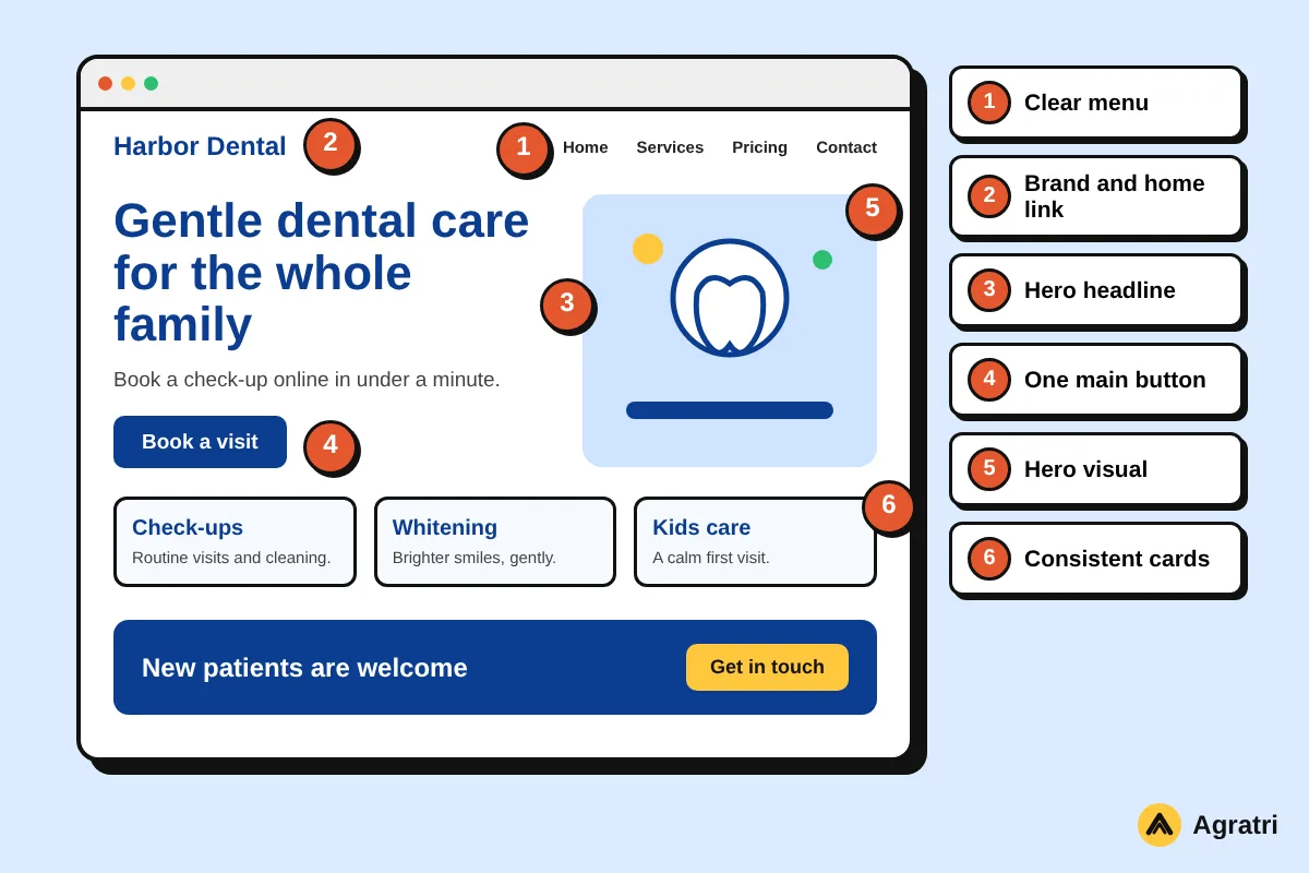
The first item on any UX audit checklist is navigation. Open the home page and look only at the menu. Can you guess where each link goes? Menu labels such as “Solutions” or “Resources” often hide what is behind them. Plain words like “Services”, “Pricing” and “Contact” work better.
Then try to reach your main service page in two clicks. If you cannot, visitors will not either. Also check that the logo links back to the home page.
2. Speed on a real phone
Load your key pages on a phone using mobile data, not office wifi. Notice how long you wait before you can read or tap anything. Google describes Core Web Vitals as a set of measures for loading, interactivity and visual stability. Slow, jumpy pages fail all three.
If the site feels slow, large images and heavy plugins are the usual cause. Our guide to WordPress speed optimization cost explains what a proper fix involves.
3. Mobile layout
Every UX audit checklist needs a mobile test. Most visitors arrive on a phone, so test the mobile layout line by line. Is the text readable without zooming? Are buttons large enough for a thumb? Does any content slide off the screen?
Also open the menu and the contact form on the phone. These two parts break more often than any other.
4. Headlines and calls to action
Read the top of each page and ask what it promises. A strong headline names the benefit and the audience. A weak one repeats the company name or says “Welcome”.
Next, count the buttons above the fold. One clear primary button beats four competing ones. As a result, visitors know exactly what to do next.
5. Forms and contact paths
Fill in your own contact form as if you were a customer. Count the fields. Every extra field lowers the chance that someone finishes it, so ask only for what you need to reply.
After you send it, check what happens. A visitor should see a clear thank-you message, and you should receive the email. A form that fails silently is the most expensive bug on any site.
6. Readability and accessibility
Check text size, line length and color contrast. Gray text on a white background looks stylish but is hard to read, especially outdoors. The W3C offers a clear introduction to web accessibility if you want to go deeper.
In addition, check that every image has a short text description and every link says where it goes. Phrases like “click here” help nobody.
7. Trust and clarity
Ask a stranger to look at your home page for ten seconds. Then ask what the company does and who it is for. If they hesitate, the page needs a clearer first line.
Also look for the basics that make people feel safe. These include real contact details, an about page, and clear policy pages. Add only what is true, since invented proof does more harm than good.
8. Visual consistency
Finally, the last item on this UX audit checklist is consistency. Compare your pages side by side. Do the buttons look the same everywhere? Do headings and spacing follow one pattern? Inconsistent design makes a site feel unfinished, even when the content is good.
A shared set of colors, type styles and components fixes this. Designers call it a design system, and it also makes later changes faster.
How to score and rank what you find
Once your UX audit checklist is complete, give each problem a score from one to three for impact and one to three for effort. Impact asks how much the problem hurts the main goal. Effort asks how long the fix will take.
Then sort the list. Start with high impact and low effort, such as a broken form or an unclear button. Leave high effort and low impact items for later. This keeps the work calm and the results visible.
A simple example
Imagine a cleaning company whose contact form emails never arrive. That problem has high impact and low effort, so it goes first. The slightly dated footer design has low impact, so it waits.
When to fix it yourself and when to get design help
Many items on your UX audit checklist turn out to be small edits. You can rewrite a headline, shorten a form or compress an image without a designer. Do these first and measure the change.
Some findings point to deeper problems. A confusing page structure, a menu that does not match how people think, or a layout that needs rebuilding all call for design work. In that case, a short brief helps, and our website design brief guide shows what to include.
If you plan a bigger change, read the WordPress redesign checklist before you touch anything. It explains how to avoid losing search rankings along the way.
Agratri offers UI/UX design for websites, with research, wireframes, page designs and a design system delivered in Figma. If your audit shows problems that need more than quick edits, contact us and describe what you found.
Frequently asked questions
How long does a UX audit take?
A basic audit with this UX audit checklist of four or five key pages takes a few hours. A deeper review with user testing takes longer. Start small, because a quick audit still finds the biggest problems.
Do I need analytics to use a UX audit checklist?
No. Analytics help you pick which pages to review, but you can start with your own testing. Walk through the site as a new customer would, and note every point of confusion.
What is the difference between a UX audit and a redesign?
An audit finds problems. A redesign changes the look and structure of the site. Often the audit shows that a few edits are enough, which saves money.
How often should I repeat the audit?
Run your UX audit checklist once or twice a year, and again before any big redesign. Also repeat it after major changes, such as a new theme or a new checkout flow.
Can I audit my own website?
Yes, but you know the site too well. Ask one or two people who have never used it to complete a task while you watch. Their hesitations are the most useful data you will get.
Your next step
Pick one goal, run the UX audit checklist on your four key pages, and score what you find. Fix the quick wins this week. If the audit shows structural problems, talk to our team about UI/UX design or theme customization so the next version works better for your visitors.